Implementing Workspace Dashboard UI Components Using Storybook
Introduction
In the recent pull request, I embarked on a significant project to implement the workspace dashboard UI components, aiming for a seamless user experience and robust performance. This effort was part of our ongoing work on issue #394 and set the foundation for the /workspaces/:workspaceId route, which will be implemented in a follow-up PR. The development approach I employed prioritized using Storybook for component development to prevent disruptions to the existing UI.
Purpose and Context
The goal was to create a comprehensive set of UI components for the workspace dashboard, providing interactive and responsive elements that cater to various user needs and access levels. This implementation supports features like dark mode, interactive charts, and tier-based access controls. By using Storybook, I ensured that the components were developed in isolation, minimizing the risk of breaking changes to the main application and allowing for easy testing and iteration.
Technical Implementation
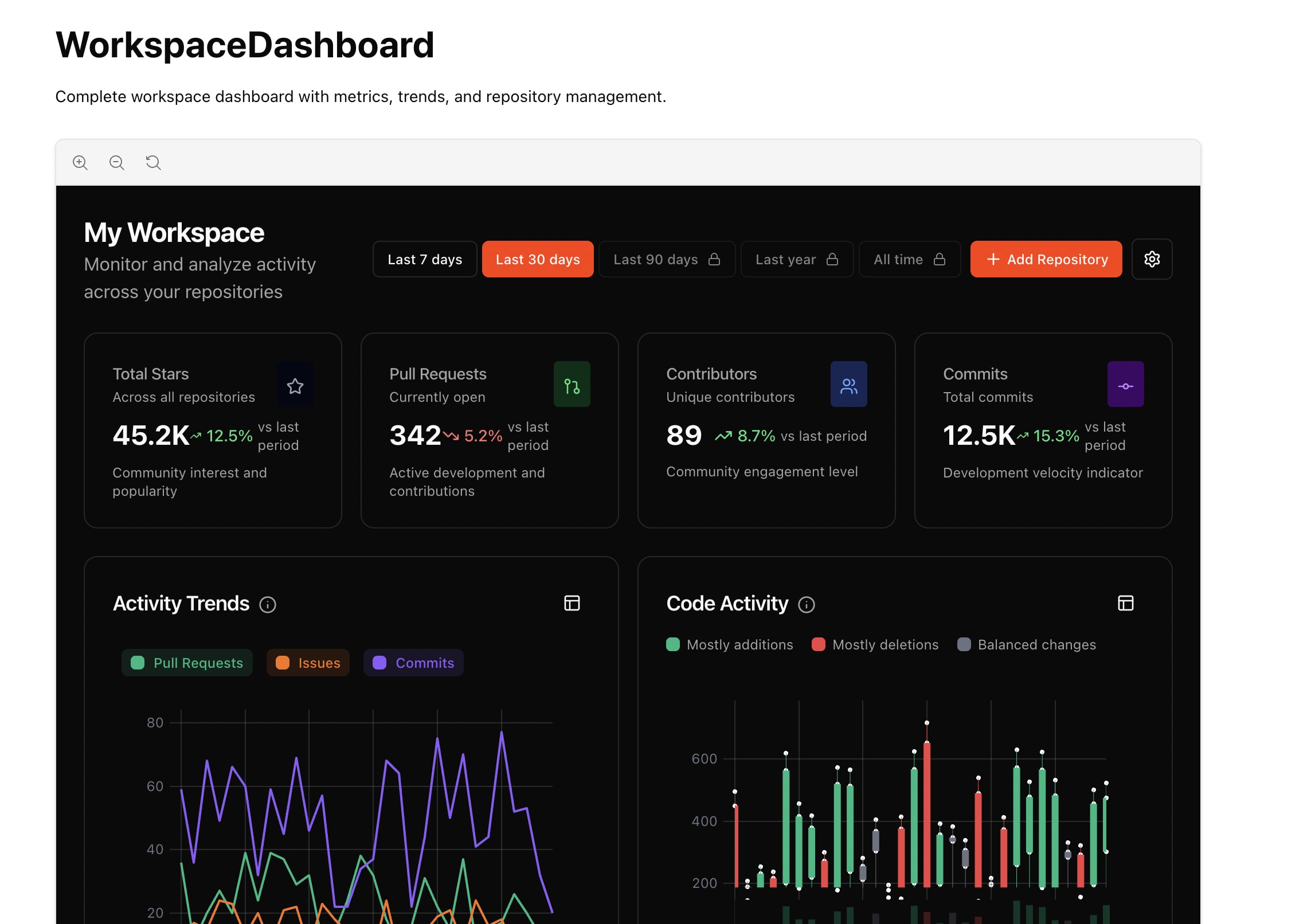
Core Components
- WorkspaceDashboard: Acts as the main container using a responsive grid layout.
- MetricCard: Displays key metrics with trends and smart formatting.
- TrendChart: Utilizes
uPlotfor performance-optimized line charts. - ActivityChart: Implements candlestick visualization for code activity patterns.
- RepositoryList: Built with TanStack Table for sorting, filtering, and pinning capabilities.
- TimeRangeSelector: Offers a time period selector paired with tier-based access control.
Key Features
- Dark Mode Support: Automatic theme detection ensures a seamless transition between light and dark modes.
- Interactive Charts: Charts feature expand/collapse functionality and custom tooltips for detailed metrics.
- Tier-Based Features: Provides functionality tailored to different user tiers (free/pro/enterprise).
- Smooth Transitions: GPU-accelerated transitions enhance user experience.
Technical Decisions
-
uPlot vs. Recharts: I opted for
uPlotoverrechartsdue to its superior performance, especially beneficial for rendering complex charts with large datasets.import uPlot from 'uplot'; const options = { width: 800, height: 300, series: [ {}, { label: "Trend", stroke: "blue", }, ], }; const data = [ [new Date('2025-08-23').getTime(), 10], [new Date('2025-08-24').getTime(), 15], ]; new uPlot(options, data, document.body); -
TanStack Table: Leveraged for its enterprise-grade capabilities in managing complex data tables.
import { useTable } from 'tanstack/react-table'; const columns = [ { Header: 'Repository', accessor: 'repo', }, { Header: 'Activity', accessor: 'activity', }, ]; const data = useMemo(() => [/* ...data */], []); const tableInstance = useTable({ columns, data }); -
SVG Sprites: Implemented an optimized icon loading system via SVG sprites, improving load times and reducing HTTP requests.
Challenges and Solutions
-
Icon Inconsistencies: Some icons were unavailable in the sprite system. I addressed this by mapping unavailable icons to existing alternatives, ensuring consistent visual feedback.
const iconMapping = { 'CircleDot': 'Circle', 'CircleX': 'XCircle', }; function getIcon(name: string) { return iconMapping[name] || name; } -
Responsive Design: Ensuring the dashboard components were responsive was crucial. I applied CSS grid layouts and media queries to achieve a flexible design that adapts to different screen sizes.
Key Code Changes
-
Component Implementation: The components were implemented with TypeScript, ensuring full type safety across the board.
-
Dark Mode Detection: A custom hook
useIsDarkModewas created for theme detection, integrating seamlessly with React’s context API to manage theme state.const useIsDarkMode = (): boolean => { const [isDark, setIsDark] = useState(false); useEffect(() => { const matchMedia = window.matchMedia('(prefers-color-scheme: dark)'); setIsDark(matchMedia.matches); const listener = (e: MediaQueryListEvent) => setIsDark(e.matches); matchMedia.addEventListener('change', listener); return () => matchMedia.removeEventListener('change', listener); }, []); return isDark; };
Impact and Benefits
The implementation of these components provides a robust foundation for future development on the workspace dashboard. By using a Storybook-first approach, I was able to deliver high-quality, isolated components that enhance the user experience with improved performance, responsiveness, and maintainability. This work will significantly expedite the integration process in the next PR, where routing and real data integration will be tackled.
Conclusion
This pull request marks a substantial step forward in our UI development process, establishing a scalable, performant, and visually appealing workspace dashboard. The decisions made here reflect a balance between cutting-edge technology and practical usability, setting the stage for future enhancements. The transition to using tools like uPlot and TanStack Table demonstrates a commitment to performance and user experience, which will continue to drive our development efforts.